

1. Work Within a Color Palette: This is probably a no-brainer, but I try to pick patterns that share at least a few colors or are complimentary colors (blue and green) or opposite colors (aqua and tangerine).

Designers actually make it easier to follow this rule because they frequently design entire collections of fabrics that are meant to coordinate, both in colorway and pattern. I picked up three fabrics for my patio project by Dwell Studio for Robert Allen called Zoo Stripe Grey, Zoo Scene Blue, and Zoo Flora Lime. The "Zoo" in the name was a clue that they were all designed to mix and match and the colors are obviously complimentary, although not too matchy-match (the Flora doesn't have the blue and gray tones in it, the Stripe doesn't have the brown). The key when working with these pre-matched collections is to not go overboard and try to throw in ALL of the choices (unless you're doing a quilt or a pennant banner or something and looking for a crazy mix) and to follow some of the other principles with regards to scale, contrast, and type of pattern. I loved both Zoo Scene (those elephants!) and Zoo Flora, but wasn't sure about putting them together - the scales were too similar and I didn't think the Flora had enough color overlap with the Scene. The Stripe, I think, compliments both and makes it work.
2. Play with Scale: I think patterns mix better if they are not all competing for attention with one another so if I'm doing two florals, I pick one that is bold and big and one that is much smaller in scale. Also keep in mind you're not necessarly going to use the two fabrics in the same proportions. If you're doing a pillow in the bold floral below, you might want to use the smaller print for the back of the pillow or for the piping or a ruffle for example so that it accents the bolder pattern rather than competes with it.


4. Don't be afraid to Mix it Up: For me the easiest things to match are completely different patterns - florals with stripes or checks, geometrics with figurals. Let your bold pattern take the staring roll and use the more moderate pattern as an accent.
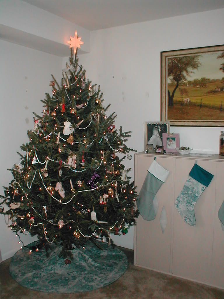
For example, for the Christmas tree skirt and stockings I made eons ago, I paired a print I think was called Christmas Toile (and sorry, I have no idea who made it) which is a big, busy, figural print showing little vignettes of the manger scene, wisemen, etc., with a much plainer, simpler small-scale check. The colors match, the patterns don't compete for attention and it all blends together harmoniously. I also threw in some solids to mix it up, because I'm ecclectic that way.
As you can see, I'll often use more than one of these principles at a time - mixing small and large, floral and geometric, and all in the same tones. Really just go with your gut and what looks pleasing to your eye - you are, after all, the one who has to live with it. And if you end up with two things that just don't seem to work together, you may be able to salvage it by tying in a third choice: two bold florals might stop competing if you pull in a stripe or colors that seem too disparate might benefit from a print that combines their palettes.
1 comment:
Unfortunately your profile isn't linked to an email address, so I'm replying openly on here. ;) I just wanted to thank you for your sweet comment on my blog!
xoxo from Germany,
Vanessa @ {nifty thrifty things}
Post a Comment